A fully customized Circular usage indicator with percentage label or custom label.
This widget can be used as an usage indicator.
If there are children widgets then the percentage label will not show up. Don't put children widgets if you want the percentage label to show up.
Circular progress with children widgets for custom labels :
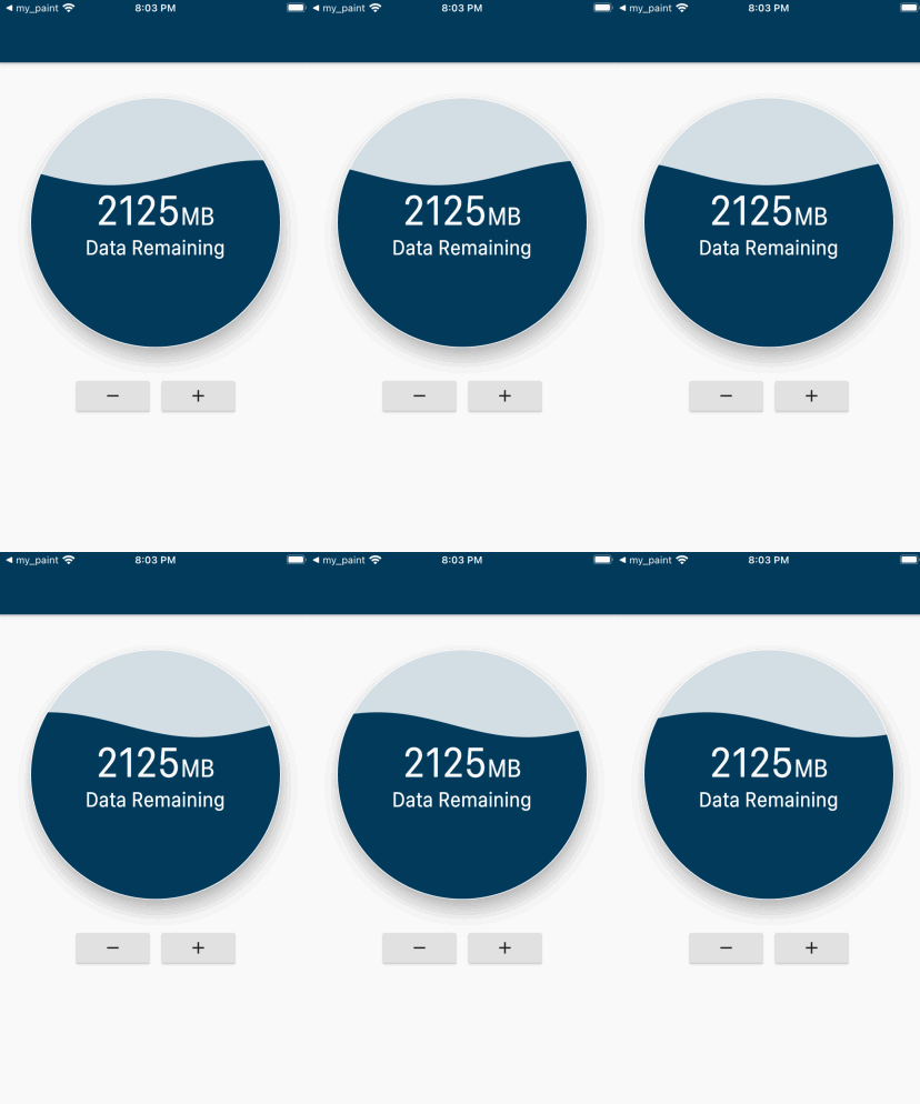
        CircularUsageIndicator(
            elevation: 15.0,
            backgroundColor: Color(0xFFD4DFE5),
            borderColor: Colors.transparent,
            progressValue: 0.5, // progress value from 0.0 to 1.0
            progressLabelStyle: TextStyle(
              // change style for percentage text.
              fontSize: 60.0,
              color: Colors.white,
              fontWeight: FontWeight.w400,
            ),
            progressColor: Color(0xFF023A5C),
            size: 300,
            borderWidth: 1.0,
            // comment children if you the percentage to show up as a label
            children: [
              // if there are children widgets then the percentage label will not show up
              Row(
                mainAxisAlignment: MainAxisAlignment.center,
                crossAxisAlignment: CrossAxisAlignment.baseline,
                textBaseline: TextBaseline.alphabetic,
                children: [
                  Text(
                    '2125',
                    style: TextStyle(
                      color: Colors.white,
                      fontSize: 50.0,
                    ),
                  ),
                  Text(
                    'MB',
                    style: TextStyle(
                      color: Colors.white,
                      fontSize: 30.0,
                    ),
                  )
                ],
              ),
              Text(
                'Data Remaining',
                style: TextStyle(
                  color: Colors.white,
                  fontSize: 25.0,
                ),
              ),
            ],
          );
Circular progress without children widgets to show percentage labels.

        CircularUsageIndicator(
            elevation: 15.0,
            backgroundColor: Color(0xFFD4DFE5),
            borderColor: Colors.transparent,
            progressValue: 0.5, // progress value from 0.0 to 1.0
            progressLabelStyle: TextStyle(
              // change style for percentage text.
              fontSize: 60.0,
              color: Colors.white,
              fontWeight: FontWeight.w400,
            ),
            progressColor: Color(0xFF023A5C),
            size: 300,
            borderWidth: 1.0,
          );