feat(customer-analytics): add explainable account health scores#31
feat(customer-analytics): add explainable account health scores#31xPolar wants to merge 5 commits into
Conversation


Co-authored-by: capy-ai[bot] <230910855+capy-ai[bot]@users.noreply.github.com>


![capy-ai[bot]](https://avatars.githubusercontent.com/in/1915919?s=60&v=4)

Co-authored-by: capy-ai[bot] <230910855+capy-ai[bot]@users.noreply.github.com>


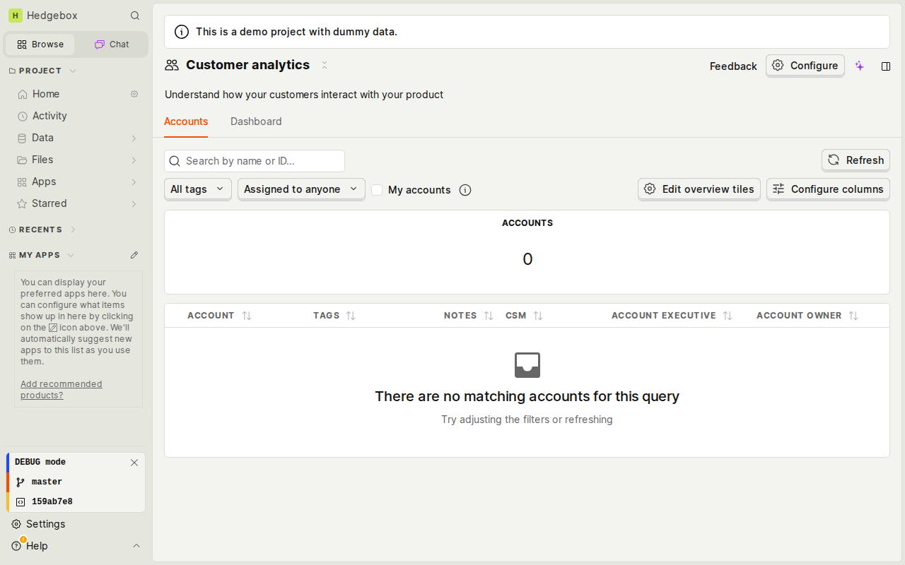
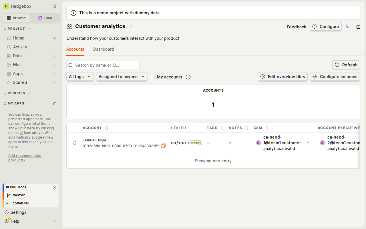
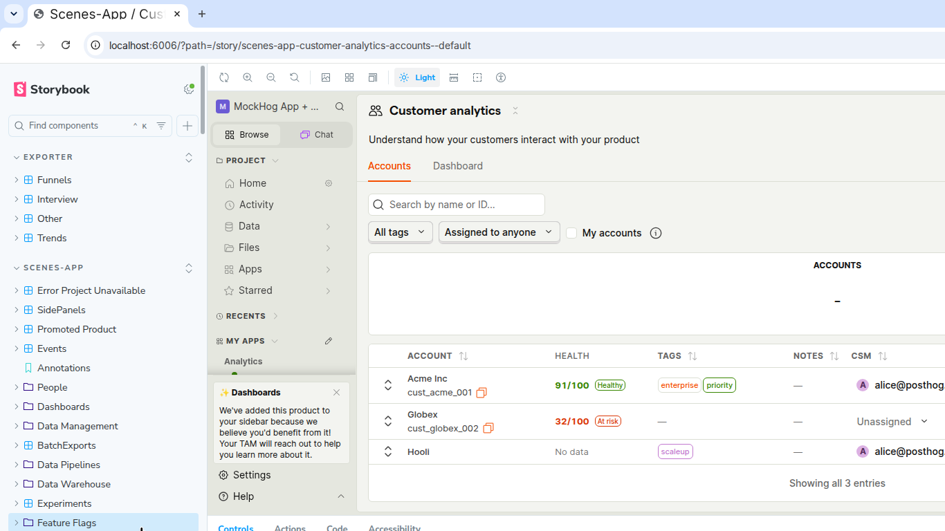
🖼️ Visual QA — Accounts health score UITested against the PR branch frontend + backend with one seeded demo account ( Before (master) — desktop 1280px
Columns: After (PR branch) — desktop 1280px
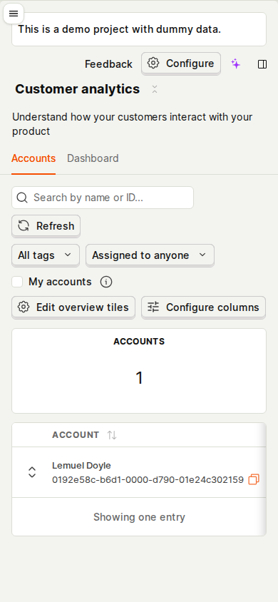
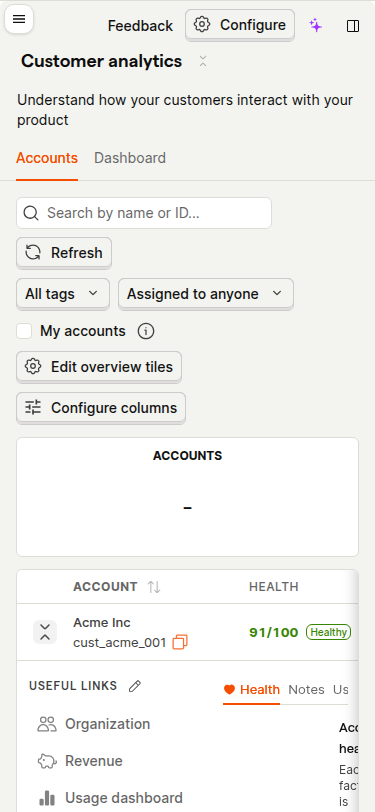
After (PR branch) — narrow 390px
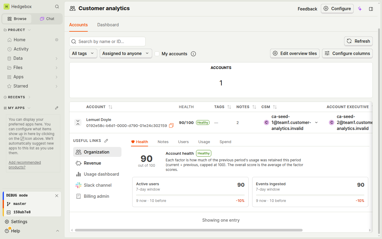
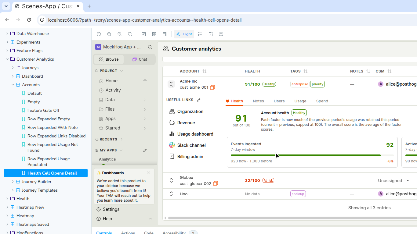
After (PR branch) — health detail expansion
Observations
|
Co-authored-by: capy-ai[bot] <230910855+capy-ai[bot]@users.noreply.github.com>
Co-authored-by: capy-ai[bot] <230910855+capy-ai[bot]@users.noreply.github.com>

Co-authored-by: capy-ai[bot] <230910855+capy-ai[bot]@users.noreply.github.com>
🖼️ Visual QA — PR #31 (explainable account health scores)Tested via Storybook with deterministic mock data (MSW). Verified three health states across desktop (1440 px) and narrow (375 px) viewports. Accounts list — desktop (1440 px)Three accounts, three health states, all rendered in the mandatory Health column:
Health detail panel — desktop (Acme Inc, 91/100 Healthy)Clicking the health cell opens the Health expansion tab, showing:
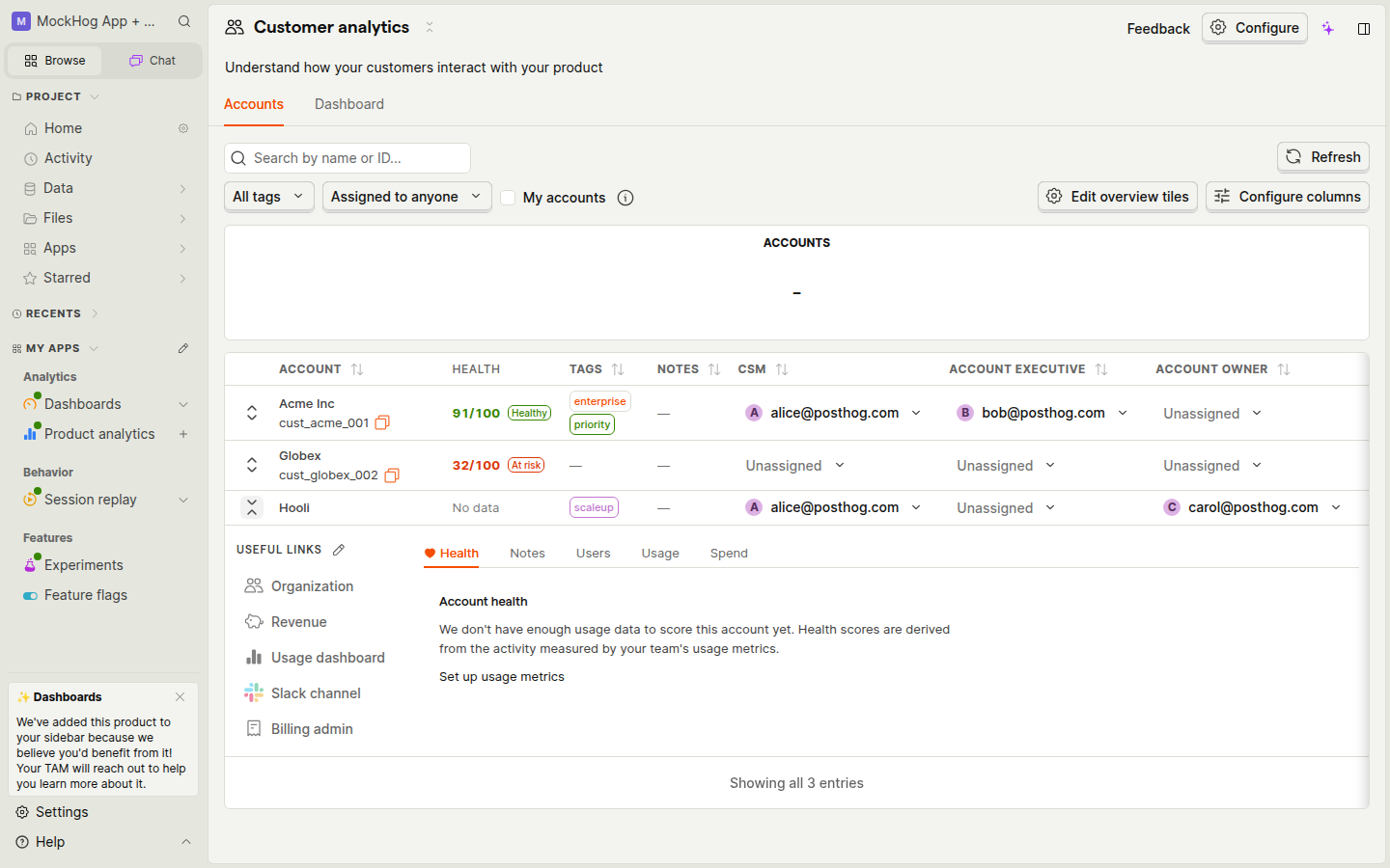
No-data expansion — desktop (Hooli)When no usage metrics are configured for an account, the Health tab shows the graceful empty state:
With a Set up usage metrics link. All three health states are visible simultaneously in the list.
Health detail — narrow (375 px / mobile)At 375 px the table collapses to ACCOUNT | HEALTH columns; the expanded health detail fits in a single-column layout. Score, status tag, and partial formula text are all legible.
Findings
No visual regressions found. All new surfaces render as expected across both viewport sizes. Screenshots captured via Storybook (MSW mocks, |
🎥 Visual QA — automated screenshot auditBranch: Before (master) — no Health columnColumns: ACCOUNT · TAGS · NOTES · CSM · ACCOUNT EXECUTIVE · ACCOUNT OWNER
After (PR) — Health column addedHEALTH is inserted as the 2nd column (between ACCOUNT and TAGS) at both widths. Desktop 1456 px — Health column visible, table empty state:
Narrow 768 px — Health column still visible, sidebar collapsed to hamburger:
Health detail expansion — default "Health" tab (no-data state)Clicking the HEALTH cell opens the row expansion and lands on the Health tab (new default). When no usage metrics are configured the panel shows a friendly empty state with a "Set up usage metrics" CTA. Tabs: Health · Notes · Users · Usage · Spend. Desktop — health detail panel expanded:
Narrow 768 px — health detail expansion open:
Column diff
Checklist
Automated visual QA by Captain Capy on 2026-06-19 against commit |


🔍 Visual QA — PR #31
|


| List view | Health detail expanded |
|---|---|
 |
 |
At 375px, ACCOUNT and HEALTH columns are both visible; remaining columns (TAGS, NOTES, etc.) scroll horizontally. Health badges remain legible. The expansion panel stacks cleanly below the row.
Observations
| Result | |
|---|---|
| HEALTH column mandatory and in second position | ✅ |
| Score badge colour-coding (green / orange-red / neutral) | ✅ |
| Health tab is default on row expand | ✅ |
| Factor cards: metric name, window, score bar, values, trend % | ✅ |
No data state: helpful prose + "Set up usage metrics" link |
✅ |
| HEALTH column sortable (↕ indicator present) | ✅ |
| Narrow layout: columns visible, expansion in-row | ✅ |
ACCOUNTS tile shows – while loading (spinner, clears on load) |
✅ expected |
No layout breaks, overflow clipping, or z-index stacking issues spotted at either breakpoint. Health scores computed and rendered without crashing the accounts list when ClickHouse event data is absent (no_data path degrades gracefully as claimed).
Overall: ✅ Pass — frontend changes render correctly at desktop and narrow widths.
2 participants


Problem
Customer analytics users need a quick way to prioritize account outreach without relying on an opaque score. Existing usage metrics already describe the activity each team cares about, but the accounts list does not turn those signals into a comparable, inspectable health indicator.
Changes
How did you test this code?
I am an agent. I ran the focused Python scoring and accounts-query integration suites, the seed-command suite, the focused Jest suites, Ruff, oxfmt, schema generation, and
git diff --check. I also exercised the Storybook account list in a browser and recorded clicking a 91/100 Healthy account into its Health detail; the same view showed a 32/100 At risk account and a No data account.The repository-wide TypeScript check has one pre-existing error in
frontend/src/scenes/experiments/MetricsView/new/VariantTimeseriesChart.tsx; none of the changed files report TypeScript errors.Automatic notifications
Docs update
No public documentation change is required for this prototype; the product-local Accounts agent guide is updated.
🤖 Agent context
Autonomy: Human-driven (agent-assisted)
Captain Capy implemented the prototype from a human-directed request. The design deliberately reuses
GroupUsageMetricdefinitions rather than inventing a second configuration surface or a black-box model. Scores are computed at query time, bounded to the current account page, cached against metric/config fingerprints, and degrade tono_dataif optional scoring fails.Need help on this PR? Tag
/codesmithwith what you need. Autofix is disabled.