Skip to content

feat(layer-dialog): add responsive layer dialog - #793

Open
mattrothenberg wants to merge 14 commits into
mainfrom
feat/strict-layer-dialog
Open

feat(layer-dialog): add responsive layer dialog#793
mattrothenberg wants to merge 14 commits into
mainfrom
feat/strict-layer-dialog

Conversation

@mattrothenberg

@mattrothenberg mattrothenberg commented Sep 9, 2026

Copy link
Copy Markdown
Collaborator

Summary

  • add a strict LayerDialog component built on Base UI Drawer
  • derive dismissal UI from composition: an automatic X without actions, or a fixed Close/Cancel plus one primary action with actions
  • support centered or top-aligned desktop dialogs and full-width mobile bottom sheets with swipe behavior
  • add sticky title treatment, scroll masking, dismissal locking, forced modal alertdialog semantics, and custom portal-container support
  • document the API with seven live previews covering informational, action, cancellation, destructive, pending, cleanup, and alignment flows

Validation

  • pnpm --filter @cloudflare/kumo lint
  • pnpm --filter @cloudflare/kumo test — 55 files and 1,320 tests passed
  • pnpm --filter @cloudflare/kumo build
  • pnpm --filter @cloudflare/kumo-docs-astro typecheck — 0 errors

  • Reviews
    • bonk has reviewed the change
    • automated review not possible because: this new interactive component requires design and interaction review
  • Tests
    • Tests included/updated
    • Automated tests not possible - manual testing has been completed as follows:
    • Additional testing not necessary because:

@mattrothenberg mattrothenberg self-assigned this Sep 9, 2026
@mattrothenberg

Copy link
Copy Markdown
Collaborator Author

/bonk give me a thorough code review

Comment thread packages/kumo/src/components/layer-dialog/layer-dialog.tsx
Comment thread packages/kumo/src/components/layer-dialog/layer-dialog.tsx Outdated
@ask-bonk

ask-bonk Bot commented Sep 9, 2026

Copy link
Copy Markdown
Contributor

I'm Bonk, and I've done a quick review of your PR.

2 findings posted inline. No additional actionable findings.

Review notes
  • Reviewing PR feat(layer-dialog): add responsive layer dialog #793 against its supplied head SHA, starting with repository and package conventions, the full changed component, and existing review feedback.
  • Confirmed the checkout and GitHub target are PR feat(layer-dialog): add responsive layer dialog #793 at 6ef06df7a30915b954d3caa5e9ec88a7555802ef; there are no prior submitted reviews to duplicate. Next I’m inspecting the component contract, Base UI drawer behavior, exports, tests, and documentation examples for API or interaction regressions.
  • The component’s strict child validation, package entry points, and desktop/mobile gesture guards are coherent. I found two behavioral gaps: LayerDialog.Alert still permits modal={false}, contrary to alert-dialog semantics, and the portal bypasses Kumo’s documented portal-container provider; I’m submitting both as one inline review with suggestions.
  • Submitted one COMMENT review on PR feat(layer-dialog): add responsive layer dialog #793 with two inline findings, both anchored to the introduced component. git diff --check passed; the requested package checks could not run because this runner lacks pnpm and has Node 22.23.2 while the workspace requires Node ^24.12.0.

github run

@pkg-pr-new

pkg-pr-new Bot commented Sep 9, 2026

Copy link
Copy Markdown
npm i https://pkg.pr.new/@cloudflare/kumo@793

commit: 026c119

Comment thread packages/kumo/src/components/layer-dialog/layer-dialog.tsx Outdated
@ask-bonk

ask-bonk Bot commented Sep 9, 2026

Copy link
Copy Markdown
Contributor

I'm Bonk, and I've done a quick review of your PR.

Posted 1 new inline finding.

Review notes
  • Confirmed this is PR feat(layer-dialog): add responsive layer dialog #793, inspected the active review guidance and prior inline feedback, and am now checking the complete changed component, documentation, exports, and comparable overlay implementations.
  • Read all newly added LayerDialog source, tests, demos, docs, package entry points, and the existing Dialog/portal patterns. Verified the prior modal and portal-container findings remain the only published inline findings, so they will not be duplicated.
  • Compared alert behavior with Kumo’s existing AlertDialog implementation and checked package exports, changeset coverage, and changed-file integrity. The focused test command could not run because pnpm is absent from the runner (only Corepack is installed); git diff --check passed.

github run

@github-actions

github-actions Bot commented Sep 9, 2026

Copy link
Copy Markdown
Contributor

📐 Bundle Size

Consumer fixtures bundled against packages/kumo/dist (peers external, minified ESM).

Fixture Raw Gzip Brotli
Button (root) 174.6 KB 49.9 KB 43.1 KB
Button (components/button) 174.5 KB 49.9 KB 43.0 KB
Button + Dialog + Select (root) 299.5 KB 85.8 KB 71.8 KB
Button + Dialog + Select (component subpaths) 299.5 KB 85.9 KB 71.8 KB
Chart (root) 218.6 KB 63.4 KB 54.7 KB
Chart (components/chart) 218.5 KB 63.3 KB 54.7 KB
Badge (components/badge) 44.7 KB 11.7 KB 10.0 KB
Flow (components/flow) 208.9 KB 58.3 KB 50.5 KB
Button (primitives/button) 12.2 KB 4.4 KB 3.9 KB
Primitives barrel 635.8 KB 176.9 KB 139.3 KB
Code highlighting (code) 2.08 MB 467.9 KB 349.2 KB

npm tarball: 534 files, 1.47 MB packed, 6.84 MB unpacked.

⚠️ 22 flagged files in tarball (tests / raw scripts)
  • dist/blocks-source/resource-list/resource-list.test.tsx
  • scripts/component-registry/cache.ts
  • scripts/component-registry/discovery.ts
  • scripts/component-registry/example-cleanup.ts
  • scripts/component-registry/index.test.ts
  • scripts/component-registry/index.ts
  • scripts/component-registry/markdown-generator.ts
  • scripts/component-registry/metadata.ts
  • scripts/component-registry/props-filter.ts
  • scripts/component-registry/schema-generator.ts
  • scripts/component-registry/sub-components.ts
  • scripts/component-registry/types.ts
  • scripts/component-registry/utils.ts
  • scripts/component-registry/variant-parser.ts
  • scripts/css-build.ts
  • scripts/generate-primitives.ts
  • scripts/theme-generator/config.ts
  • scripts/theme-generator/generate-css.test.ts
  • scripts/theme-generator/generate-css.ts
  • scripts/theme-generator/index.ts
  • scripts/theme-generator/migrate.ts
  • scripts/theme-generator/types.ts

Report-only: no size thresholds are enforced yet.

Commit: 026c1197

@github-actions

github-actions Bot commented Sep 9, 2026

Copy link
Copy Markdown
Contributor
Visual Regression Report — 32 changed, 13 unchanged

32 screenshot(s) with visual changes:

Button / Basic

243 px (0.27%) changed

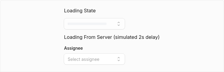
Before After Diff
Before After Diff

Button / Variant: Primary

473 px (0.53%) changed

Before After Diff
Before After Diff

Button / Variant: Ghost

101 px (0.11%) changed

Before After Diff
Before After Diff

Button / Sizes

1,697 px (1.92%) changed

Before After Diff
Before After Diff

Button / With Icon

819 px (0.92%) changed

Before After Diff
Before After Diff

Button / Loading State

195 px (0.22%) changed

Before After Diff
Before After Diff

Button / Disabled State

232 px (0.26%) changed

Before After Diff
Before After Diff

Button / Title

848 px (0.96%) changed

Before After Diff
Before After Diff

Button / Disabled Link

332 px (0.37%) changed

Before After Diff
Before After Diff

Dialog / Dialog With Actions

401 px (0.45%) changed

Before After Diff
Before After Diff

Dialog / Dialog Sizes

3,060 px (3.46%) changed

Before After Diff
Before After Diff

Dialog / Dialog Alert

1,983 px (2.24%) changed

Before After Diff
Before After Diff

Dialog / Dialog Confirmation

855 px (0.97%) changed

Before After Diff
Before After Diff

Dialog / Custom Max Width

303 px (0.34%) changed

Before After Diff
Before After Diff

Dialog / Dialog With Select

383 px (0.43%) changed

Before After Diff
Before After Diff

Dialog / Dialog With Dropdown

253 px (0.29%) changed

Before After Diff
Before After Diff

Dialog (Open)

0 px (0%) changed

Before After Diff
Before After Diff

Select / Select Basic

859 px (0.97%) changed

Before After Diff
Before After Diff

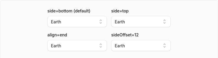
Select / Select Sizes

3,108 px (1.91%) changed

Before After Diff
Before After Diff

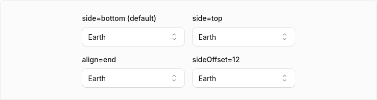
Select / Select Placement

3,530 px (2.44%) changed

Before After Diff
Before After Diff

Select / Select Dynamic Placement

2,608 px (2.51%) changed

Before After Diff
Before After Diff

Select / Select Without Label

758 px (0.86%) changed

Before After Diff
Before After Diff

Select / Select With Description

1,687 px (1.62%) changed

Before After Diff
Before After Diff

Select / Select With Error

1,730 px (1.66%) changed

Before After Diff
Before After Diff

Select / Select With Tooltip

196 px (0.22%) changed

Before After Diff
Before After Diff

Select / Select Custom Rendering

234 px (0.26%) changed

Before After Diff
Before After Diff

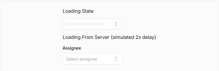
Select / Select Loading

3,161 px (1.79%) changed

Before After Diff
Before After Diff

Select / Select Disabled Options

1,217 px (1.37%) changed

Before After Diff
Before After Diff

Select / Select Disabled Items

103 px (0.12%) changed

Before After Diff
Before After Diff

Select / Select Grouped

937 px (1.06%) changed

Before After Diff
Before After Diff

Select / Select Grouped With Disabled

1,414 px (1.6%) changed

Before After Diff
Before After Diff

Select (Open)

3,292 px (0.01%) changed

Before After Diff
Before After Diff
13 screenshot(s) unchanged
  • Button / Variant: Secondary
  • Button / Variant: Destructive
  • Button / Variant: Outline
  • Button / Variant: Secondary Destructive
  • Button / Icon Only
  • Button / Link as Button
  • Button / Link with Tooltip
  • Dialog / Dialog Basic
  • Dialog / Dialog With Combobox
  • Select / Select Placeholder
  • Select / Select Multiple
  • Select / Select Complex
  • Select / Select Long List

Generated by Kumo Visual Regression

@cloudflare-workers-and-pages

cloudflare-workers-and-pages Bot commented Sep 9, 2026

Copy link
Copy Markdown

🚀 Deploying Preview to Cloudflare 🚀

Preview URL: https://feat-strict-layer-dialog-kumo-docs.design-engineering.workers.dev (commit 026c119)

This URL reflects your latest Preview deployment

Preview Deployments by commit

Status Deployment URL Commit Updated (UTC) See this deployment's details
  • Build: Success ✅
  • Deployment: Success ✅

View logs ↗
https://2b1da5cd-kumo-docs.design-engineering.workers.dev 026c119 2026-09-10T18:31:21.101Z Visit the dashboard ↗
  • Build: Success ✅
  • Deployment: Success ✅

View logs ↗
https://b5c81e28-kumo-docs.design-engineering.workers.dev 23e6d17 2026-09-10T15:23:40.852Z Visit the dashboard ↗
  • Build: Success ✅
  • Deployment: Success ✅

View logs ↗
https://49ccc164-kumo-docs.design-engineering.workers.dev a683538 2026-09-10T01:56:55.576Z Visit the dashboard ↗
  • Build: Success ✅
  • Deployment: Success ✅

View logs ↗
https://39d5a7ee-kumo-docs.design-engineering.workers.dev 66331b7 2026-09-10T01:15:16.784Z Visit the dashboard ↗
  • Build: Success ✅
  • Deployment: Success ✅

View logs ↗
https://398a0264-kumo-docs.design-engineering.workers.dev 83e5104 2026-09-09T20:55:56.207Z Visit the dashboard ↗
  • Build: Success ✅
  • Deployment: Success ✅

View logs ↗
https://838c6d43-kumo-docs.design-engineering.workers.dev 6ef06df 2026-09-09T20:07:59.958Z Visit the dashboard ↗

mattrothenberg and others added 8 commits September 9, 2026 16:36
- Add LayerDialog.Description, rendered beneath the title inside the sticky
  title frame and wired as the dialog's accessible description. Without it,
  the body copy describes the dialog so alerts still announce consequences.
- Only block user-initiated dismissal reasons, so programmatic closes via
  actionsRef or a controlled `open` work for alerts and while dismissDisabled.
  Escape now cancels alerts, matching Base UI's AlertDialog.
- Pass alert state as a prop instead of inheriting context, so a plain Root
  nested inside an Alert no longer becomes an alert.
- Move Body's title/close-button slots to a private context so they are not
  part of the public props.
- Resolve size and verticalAlign through resolveVariant to avoid crashes on
  unknown values.
- Replace the nonexistent shadow-m utility with an explicit shadow.
- Export LayerDialogProps as a real type and categorize the component as
  Overlay so the registry documents the root props.
- Add Installation, Usage, and API Reference sections to the docs page and
  move demo intro copy into Description.

Co-Authored-By: Claude Fable 5.1 <noreply@anthropic.com>
Claude-Session: https://claude.ai/code/session_01DVfWmxDS5smTdZh5mx9cbq
The ScrollArea viewport is always `overflow: scroll`, so WebKit rubber-bands
it even with no overflow. `overscroll-contain` only stops chaining; switch to
`overscroll-none` so the element's own bounce is disabled too. Drawer swipe
detection reads scroll height, not overscroll-behavior, so swipe-to-close is
unaffected.

Co-Authored-By: Claude Fable 5.1 <noreply@anthropic.com>
Claude-Session: https://claude.ai/code/session_01DVfWmxDS5smTdZh5mx9cbq
The popup hardcoded `max-h-[calc(100dvh-3rem)]` while the top-aligned
variant added 4rem of viewport padding, so a max-height dialog could
extend past the bottom edge. Follow Base UI's inside-scroll pattern:
each verticalAlign variant reserves vertical padding on the viewport and
the popup fills it with `max-h-full`, so the cap can never drift from the
alignment. Mobile sheets keep their 85dvh cap.

Add a test pinning the contract and a "Maximum height" docs section with
a tall-content demo for both placements.

Co-Authored-By: Claude Fable 5.1 <noreply@anthropic.com>
Claude-Session: https://claude.ai/code/session_01DVfWmxDS5smTdZh5mx9cbq
@mattrothenberg

mattrothenberg commented Sep 10, 2026

Copy link
Copy Markdown
Collaborator Author

One design detail I've been noodling on is the 'sticky' behavior for the title + description. From a spacing perspective, I think it looks way nicer for the title + description to be visually grouped together, but it adds a lot of height once it becomes sticky. Could we do something fancy like this to de-emphasize the description?

I could also be overthinking this and we should just put description in the body content and not worry about this :) Particularly curious what you think @hkfoster

Fancy

CleanShot.2026-09-09.at.22.00.26.mp4

Less Fancy

CleanShot.2026-09-09.at.22.08.07.mp4

mattrothenberg and others added 5 commits September 10, 2026 11:20
Once the body scrolls past the header threshold, the description
collapses under the title (grid-template-rows 1fr -> 0fr plus opacity)
and unfolds again at the top. It stays in the DOM so aria-describedby
keeps resolving.

Collapsing gives the description's height to the scroll viewport, which
shrinks the scroll range. If the content only barely overflows, that
would clamp scrollTop under the threshold and re-expand in a loop, so
the handler only condenses when enough overflow survives the collapse.

Measured in headless Chromium at 120Hz with 600 rows each holding an
Input: collapse/expand max frame 9.1ms vs 8.8ms idle, zero frames over
20ms. At 3000 rows the only 16.7ms frames match plain scrolling.

Co-Authored-By: Claude Fable 5.1 <noreply@anthropic.com>
Claude-Session: https://claude.ai/code/session_01DVfWmxDS5smTdZh5mx9cbq
Alerts no longer force a red primary action. Actions.Primary accepts
variant="primary" (default) or variant="destructive", so a critical
but non-destructive confirmation keeps brand styling while deletes opt
into danger explicitly. Documented in the API reference alongside the
existing loading prop.

Co-Authored-By: Claude Fable 5.1 <noreply@anthropic.com>
Claude-Session: https://claude.ai/code/session_01DVfWmxDS5smTdZh5mx9cbq
The X button's accessible name and the footer dismiss text were
hardcoded English. Content now takes closeLabel for the X, and Actions'
dismissLabel is plain text instead of a close/cancel enum, defaulting
to Close (Cancel inside Alert). Both are documented under Localization.

Co-Authored-By: Claude Fable 5.1 <noreply@anthropic.com>
Claude-Session: https://claude.ai/code/session_01DVfWmxDS5smTdZh5mx9cbq
Sign up for free to join this conversation on GitHub. Already have an account? Sign in to comment

Labels

None yet

Projects

None yet

Development

Successfully merging this pull request may close these issues.

1 participant